Somewhere in your wiki sleeps a magnificent architecture diagram. Three hours of Visio, impeccable arrows, colors by domain. It has a single flaw: it describes the system of two years ago. Nobody updated it, because updating a PNG requires finding the source file, the tool, and the courage.
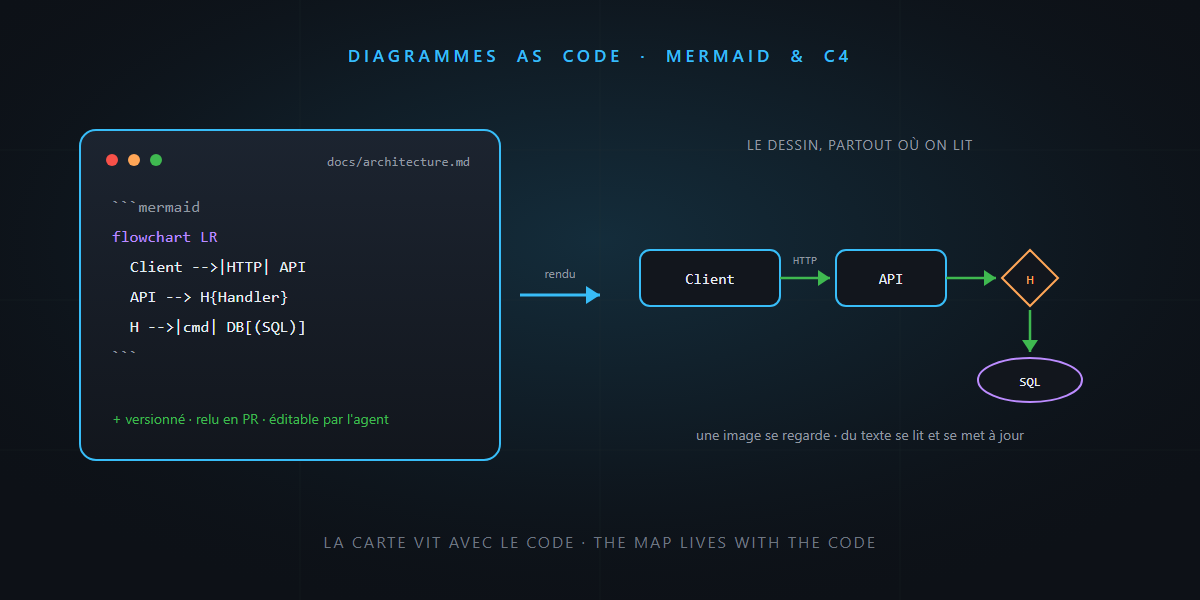
After ADRs and yesterday’s glossary, here’s the third piece of a repository that talks: diagrams as code. The idea fits in one sentence — a diagram written as text, versioned with the code, rendered on the fly. And in the agent era, it changes everything: an image, the AI looks at; text, it reads and updates. You’ll see: it’s not rocket science.
The problem: the map and the territory
An architecture diagram is a map. And a wrong map is worse than no map: it gives you confidence in the wrong direction. All image-diagrams end up wrong, for a mechanical reason: the update cost is disproportionate. Changing the code takes two minutes; reopening Visio, finding the .vsdx, redrawing, re-exporting, re-uploading to the wiki takes twenty. Guess which step gets skipped.
Diagrams as code break that mechanism: the “source” of the drawing is a block of text in the repository, next to the code it describes. Updating it is a three-line edit, reviewed in a pull request like everything else.
Mermaid: the standard that renders itself
Mermaid has become the default choice, for one decisive reason: GitHub, GitLab, Azure DevOps and VS Code render it natively. A code block in any Markdown, and the drawing appears:
```mermaid
flowchart LR
    Client[Blazor WebApp] -->|HTTP| API[Minimal API + Carter]
    API --> H{CQRS Handler}
    H -->|commands| DB[(SQL Server)]
    H -->|queries| RD[(Read models)]
    API -.->|events| BUS[/Service Bus/]
```
That block lives in your README.md, in an ADR, in docs/architecture.md — and it renders drawn wherever the file is read. No tool to install, no export, no attachment.
Mermaid covers the everyday essentials:
| Type | For drawing what |
|---|---|
flowchart |
flows, dependencies between components |
sequenceDiagram |
who calls whom, in what order — perfect for an API |
erDiagram |
the data model and its relationships |
stateDiagram |
an entity’s statuses (order, policy, claim…) |
C4Context / C4Container |
high-level C4 views |
For the big picture, the C4 model is worth the detour: four zoom levels (context, containers, components, code), of which the first two cover 90% of projects. A C4 context diagram in Mermaid in the README, and any newcomer — human or agent — knows in thirty seconds who talks to whom.
Why it’s worth double in the AI-agent era
Back to the opening distinction, because it carries the whole article:
- A PNG is opaque. The agent can at best “look” at it with vision and extract an approximate description — and it will never be able to modify it.
- A Mermaid block is data. The agent reads it like code: every node, every arrow, every label. And above all, it can edit it — the diagram joins the work loop instead of being decoration.
Concretely, three uses that change the daily routine:
- Instant re-contextualization. “Read
docs/architecture.mdbefore starting”: the diagrams give the agent the system’s topology in a few hundred tokens — infinitely denser than an explanation in prose. - Generation on demand. “Draw the sequence diagram for this endpoint”: the agent reads the code and produces the Mermaid in thirty seconds. The diagram that didn’t exist becomes free — and will seed the discussion in review.
- Updates in the same PR. The instruction that changes everything, to carve into your agent instructions: “if your change modifies a flow described in docs/, update the diagram in the same PR”. The map and the territory move together — the reviewer sees the code and the map change in the same diff.
When a diagram deserves to exist
Same selectivity logic as ADRs and the glossary — the value comes from what you refuse to draw:
- ✅ The context view (who talks to whom): one per system, always.
- ✅ The non-obvious sequences: authentication, payment saga, retry — the things you re-explain at every onboarding.
- ✅ The stateful lifecycles: an order’s statuses and their legal transitions.
- ❌ The exhaustive class diagram: the code already says it, better.
- ❌ The 200-box wall poster: unreadable on screen, wrong within a month. Ten small, focused diagrams beat one fresco.
The honest word
- Mermaid is not Visio. Layout is automatic and sometimes stubborn: you don’t always get exactly the arrangement you dreamed of, and very large graphs turn to spaghetti. That’s the price of the three-line update — and a healthy incentive to keep things small.
- Rendering varies by tool. GitHub limits some newer types (C4 diagrams notably); test where your team actually reads the docs.
- A diagram as code can lie too. It doesn’t go stale on its own, but it goes stale. The difference: the update costs three lines in the PR that changes the code — no more excuses.
In summary
- Image-diagrams all end up wrong, because updating them costs twenty times more than updating the code. Diagrams as code (Mermaid, C4) put the map back in the repository, versioned and reviewed in PRs.
- GitHub, GitLab and VS Code render Mermaid natively: one Markdown code block, zero tools, zero exports.
- To an AI, an image is opaque; Mermaid is data: the agent reads it to re-contextualize, generates it from the code, and updates it in the same PR as the change.
- Selectivity as always: context, tricky sequences, state lifecycles — ten small diagrams beat a wall fresco.
Next time someone asks “got a schema for this?”, the answer fits in a text block next to the code — and your agent will maintain it with you. And that, honestly… it’s not rocket science.